Getting OIG Information Your Way
People consume information in different ways. It’s not a generational issue, it’s a matter of how people process things and what method fits best into their lives: some prefer to read information, others like videos, some would rather listen, and others take advantage of multiple modes of interaction. New technologies have expanded the portfolio of products available to convey information, giving us multiple ways to stay informed.
While the written report remains the backbone of OIG content – it is the best way to convey the breadth and depth of information from our audits and research – we continually explore how to supplement it with other channels:
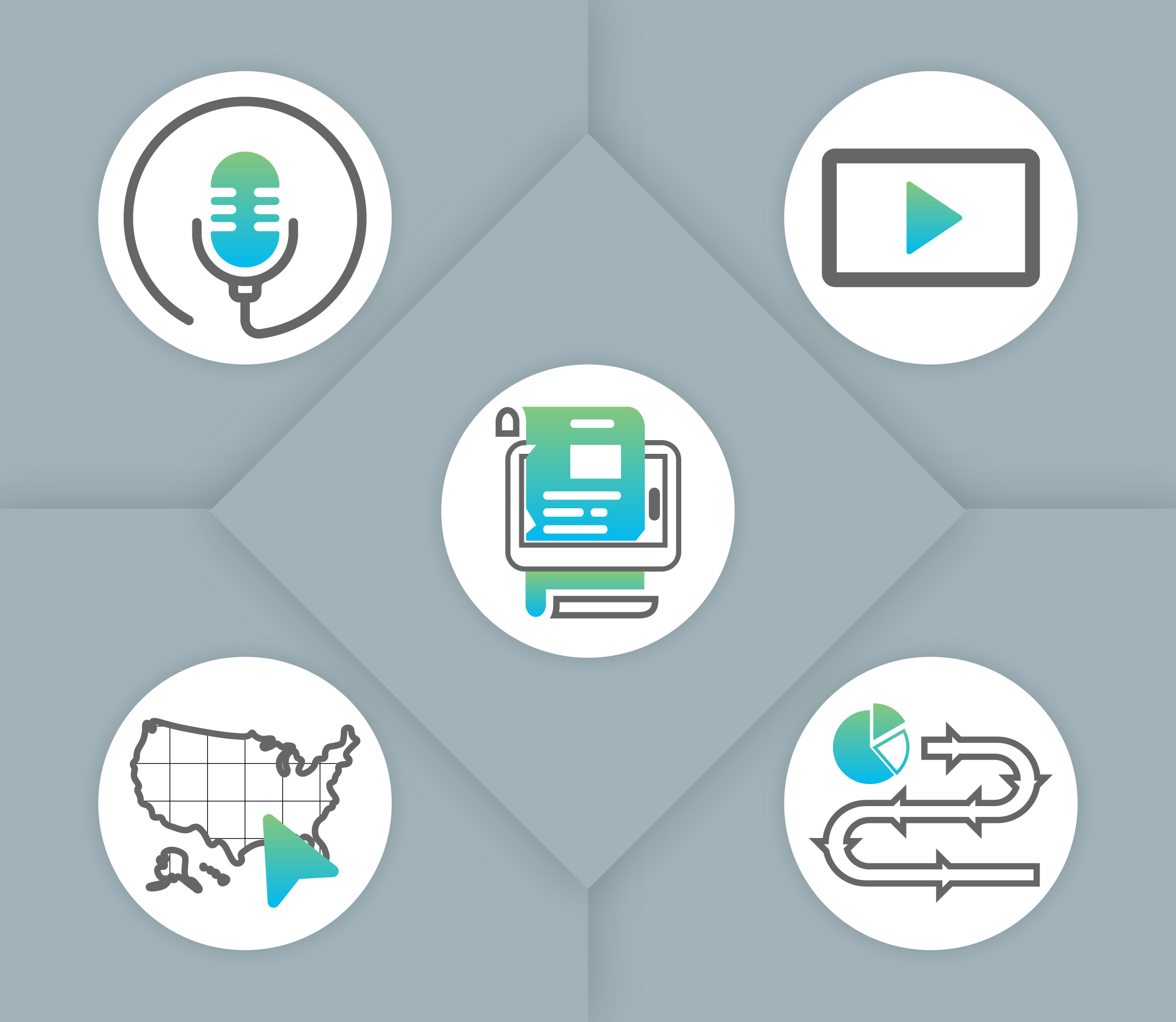
Digital Stories – This tool allows us to create a visual story to accompany some of our work, making it more accessible and easier to understand. In just a few minutes, you get an interactive summary of the report. A few examples of how we’ve used it are for the Postal Retirement Funds in Perspective: Historical Evolution and Ongoing Challenges white paper and our latest Semiannual Report to Congress. We also use another type of story map to highlight all of the work in our Field Operations Review Team has done and in our Trends in New Delivery Points white paper.
Podcasts – For the audiobook crowd (people that prefer to learn by hearing), we create podcasts in support of some of our work. On our website we have a dedicated podcast page, where you can hear directly from our staff who worked on the papers. For example, you can get insights on our Investment Trends in Sustainable Postal Processing Operations white paper in this five-minute podcast.
Videos – While an informative video can require more resources to produce, it can also be highly effective in engaging an audience. We’ve used videos to show who we are, what it’s like to work at the OIG, and celebrate our 25th anniversary. You can follow us on our YouTube channel.
Interactive Data Visualization – We incorporate this feature to convey data in new ways, such as on maps. You can see examples on our Service Performance page and Closed Investigations page.
Infographics – We use them in our reports and on our website to visually convey data or other information. You can see some examples on our Audit page, in this white paper on The Paper Shortage and its Effects on Mail (see page 4), and on our page to help figure out who to contact with mail problems.
What do you think of our different products? If you have a new idea for how we can share our work with you, let us know.

Leave a Comment